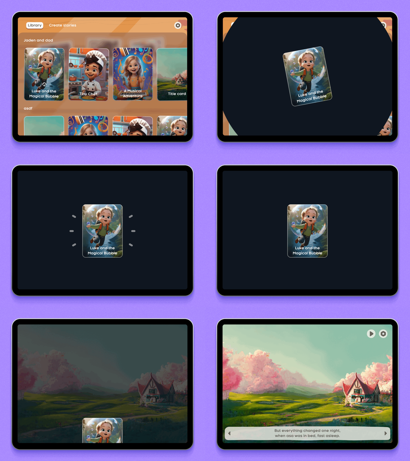
The Challenge
Creating meaningful family interactions in the digital age—bridging physical distance through personalized, engaging storytelling experiences that work for both parents and young children.
Process
User Research
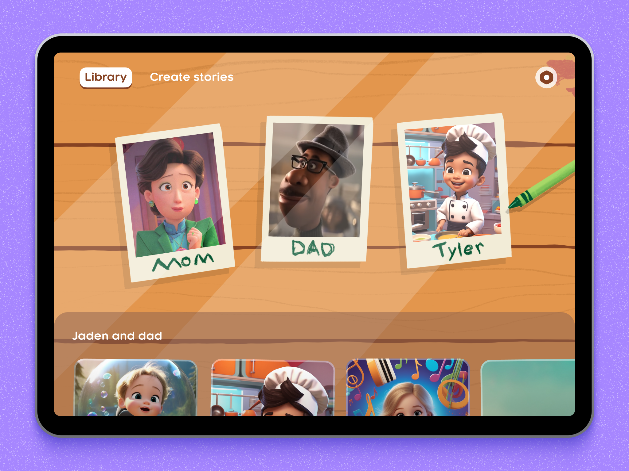
We began with surveys and interviews with parents and children. Key insights included the need for larger touch targets for younger users and a preference for more visual storytelling elements. These insights guided several design iterations.
Usability Testing
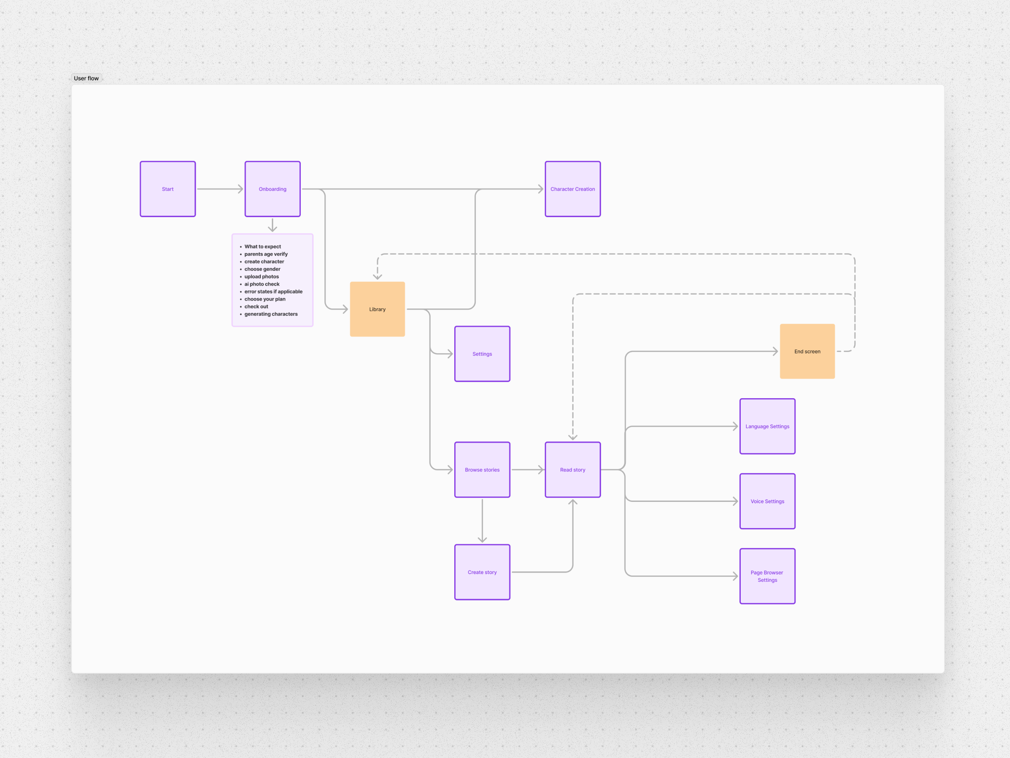
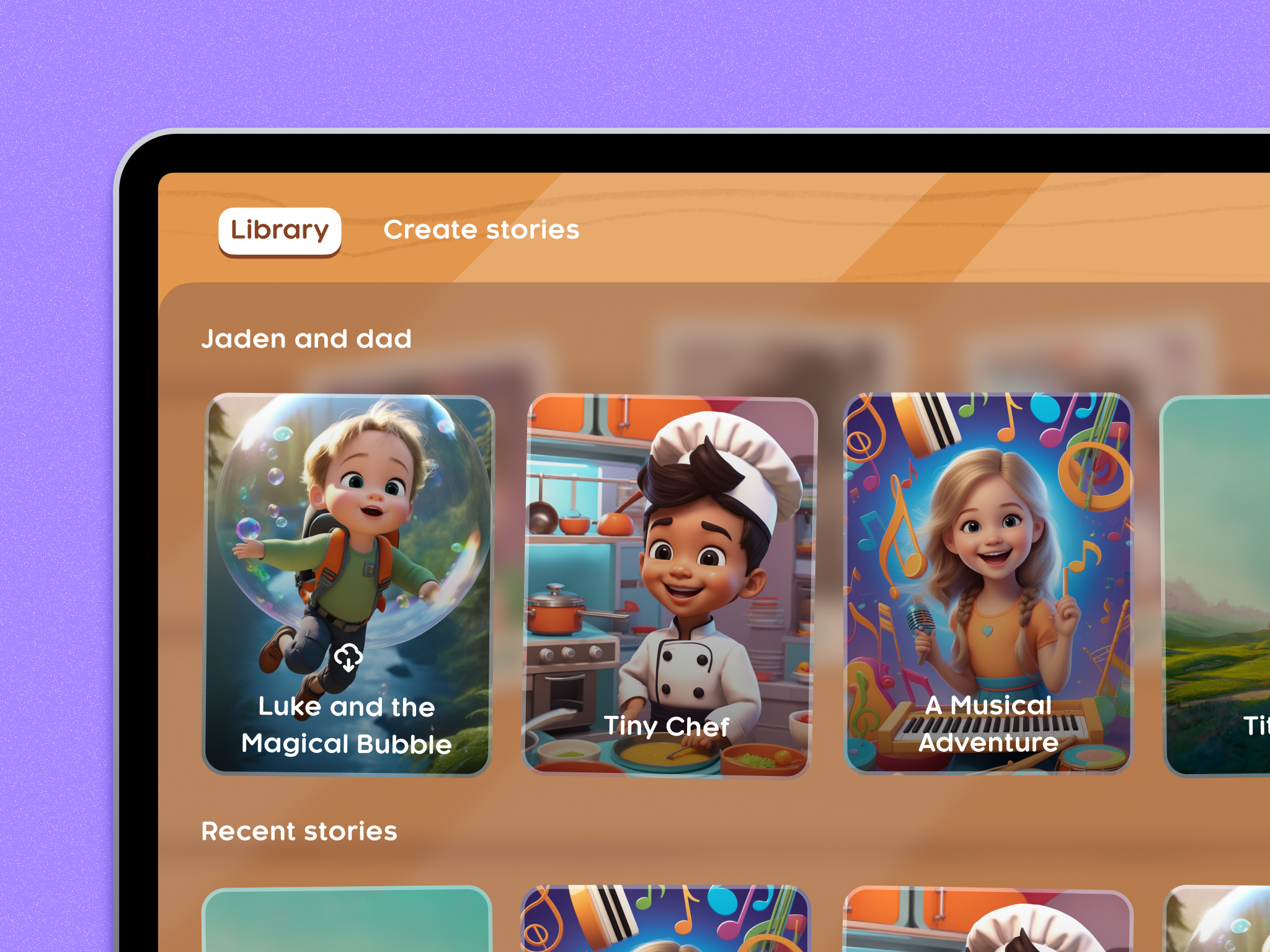
I used flow diagrams during usability testing to ensure navigation was intuitive and that users could easily find and use all the app's features.
Key Design Work
Storybook Reading Experience
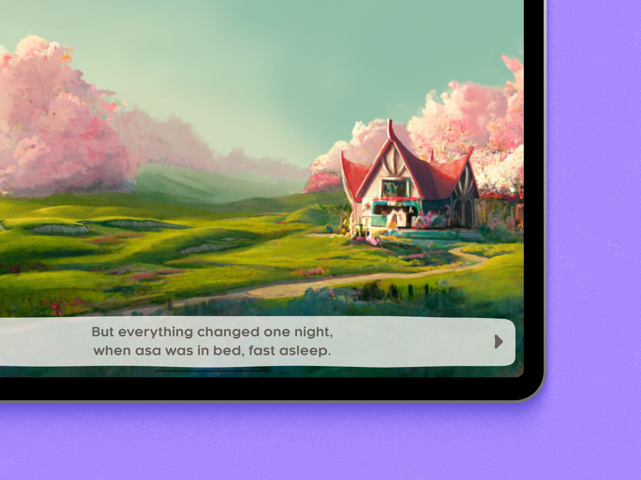
The handcrafted wavy design of the textbox background adds whimsy and charm, helping with the storybook feel and making the text more engaging for users.
Subscription Flow
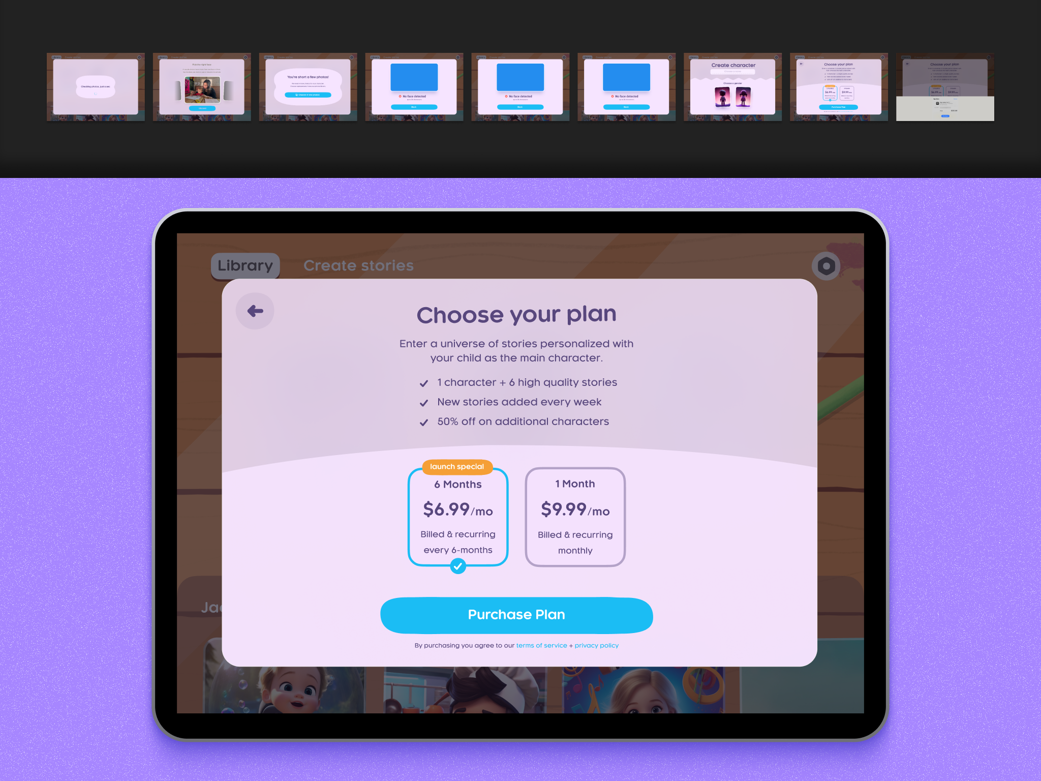
The main screen makes it easy to choose a subscription plan with clear options. Benefits are laid out clearly—new stories every week, discounts on extra characters. The design keeps things simple so users can quickly understand their options.
Design System
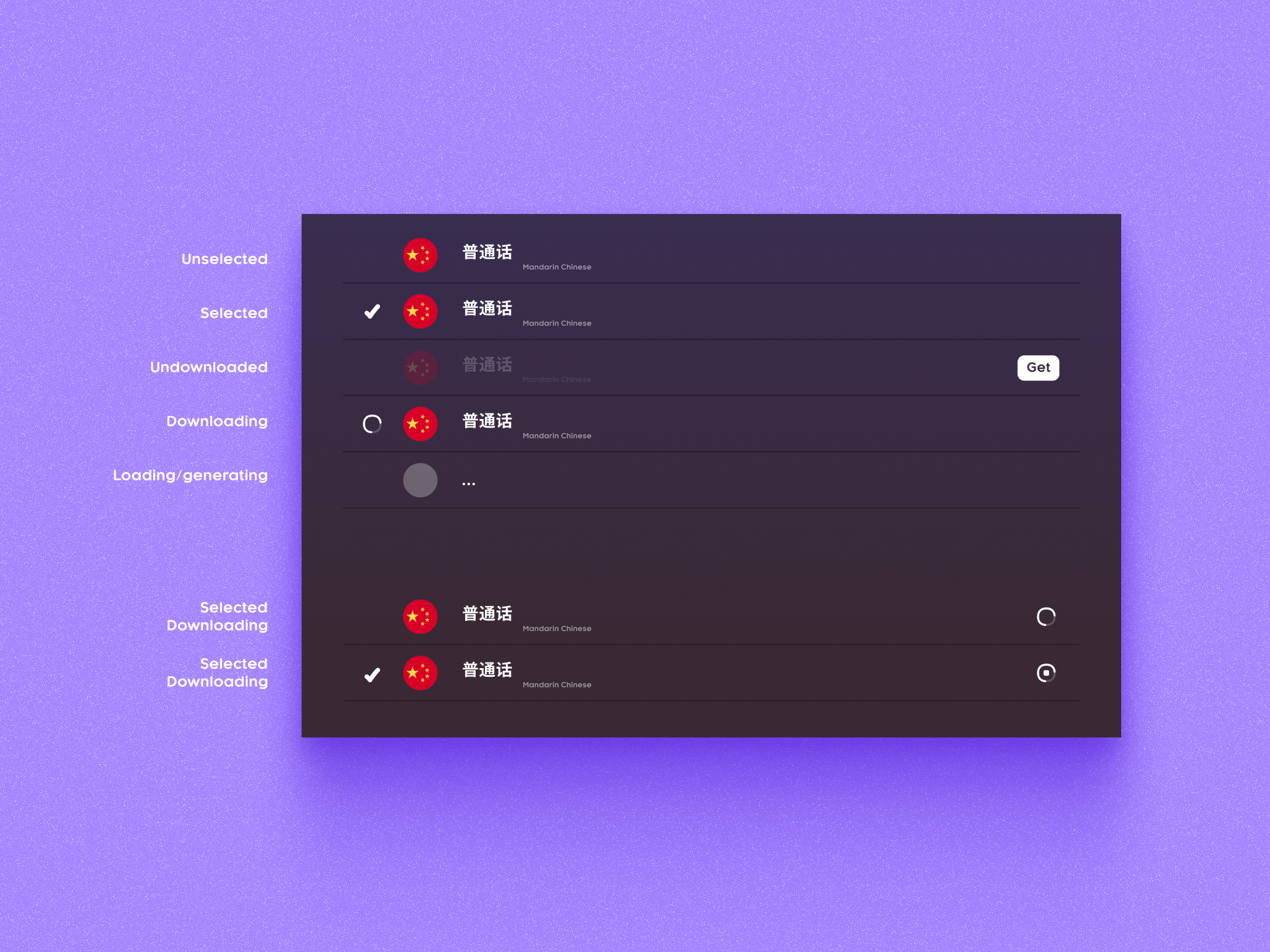
Creating multiple UI component variants was crucial—from language selection states that help users understand their actions, to a comprehensive button system with primary, secondary, and tertiary styles. These clear variations also helped during the designer-developer handoff.
